

利用模糊实现视觉3D效果实例讲解
利用CSS模糊滤镜与清晰对比构建视差,可实现视觉3D效果。例如在文字3D旋转中,对字母单独应用模糊动画;落叶效果则通过不同模糊程度、缩放和速度,模拟近、中、远景层次,增强立体感和深度。
这篇文章带大家看看如何用模糊这个 CSS 滤镜,玩出视觉上的 3D 效果。听起来有点反直觉?其实原理很简单:在现实世界中,离我们近的物体通常清晰,远的则相对模糊。利用清晰与模糊两种状态的对比,就能构建出视差效果,就像下面这样:

在 CSS 里,模糊滤镜 filter: blur() 配合 transform-style: preserve-3d 就能实现这种效果。
实现一个文字的 3D 变换
先搞定文字本身的 3D 变换。这一步不复杂,核心是用 transform-style: preserve-3d 和 perspective,让文字绕着 Y 轴旋转。
简单代码示例:
CSS3DEFFECT
body {
    perspective: 160vmin;
}
p {
    font-size: 24vmin;
    transform-style: preserve-3d;
    animation: rotate 10s infinite ease-in-out;
}
@keyframes rotate {
    0% {
        transform: rotateY(-45deg);
    }
    50% {
        transform: rotateY(45deg);
    }
    100% {
        transform: rotateY(-45deg);
    }
}
这样就能得到一个 3D 文字旋转效果:

实现文字的模糊
光有 3D 旋转还差点意思,缺少远近的虚实对比。我们需要让离我们近的文字清晰,远的模糊。但每个文字的位置不同,得单独处理。
把 HTML 结构拆开,每个字母一个元素:
    C
    S
    S
    3
    D
    E
    F
    F
    E
    C
    T
完整 CSS 代码(用 SASS 写更高效):
@import url('https://fonts.googleapis.com/css2?family=Lobster&display=swap');
$count: 12;
body, html {
    font-family: 'Lobster', cursive;
    perspective: 160vmin;
    overflow: hidden;
}
p {
    margin: auto;
    font-size: 24vmin;
    transform-style: preserve-3d;
    animation: rotate 10s infinite ease-in-out;
    p {
        text-shadow:
            1px 1px 0 rgba(0, 0, 0, .9),
            2px 2px 0 rgba(0, 0, 0, .7),
            3px 3px 0 rgba(0, 0, 0, .5),
            4px 4px 0 rgba(0, 0, 0, .3),
            5px 5px 0 rgba(0, 0, 0, .1);
        &:nth-child(-n+5) {
            animation-delay: -5s;
        }
    }
}
@for $i from 1 to 7 {
    p:nth-child(#{$i}),
    p:nth-last-child(#{$i}) {
        animation: filterBlur-#{$i} 10s infinite ease-in-out;
    }
    @keyframes filterBlur-#{$i} {
        0% {
            filter: blur(0px) contrast(5);
        }
        50% {
            filter: blur(#{7 - $i}px) contrast(1);
        }
        100% {
            filter: blur(0px) contrast(5);
        }
    }
}
@keyframes rotate {
    0% {
        transform: rotateY(-45deg);
    }
    50% {
        transform: rotateY(45deg);
    }
    100% {
        transform: rotateY(-45deg);
    }
}
这里面有几个小技巧值得注意:
1. 第一个字符和最后一个字符在旋转过程中分别处于最左和最右,离我们最近和最远的效果其实是对称的,所以它们应该统一处理,第二个字符和倒数第二个同理。利用 SASS 的 :nth-child 和 :nth-last-child 可以高效编写。
2. 每次旋转时,有一半文字清晰,一半模糊,需要用 animation-delay 让一半动画延迟一半周期。
3. 配合 text-shadow 能让文字更立体。
最终效果如下:

使用模糊构建落叶效果
合理运用模糊,即使没有 transform-style: preserve-3d 和 perspective,也能构建出不错的 3D 感。之前在一个视频教学网站看到这个落叶效果,就是利用模糊和简单的层级关系,让画面非常真实。
Falling Lea ves

.leaf {
  position: absolute;
  width: 100%;
  height: 100%;
  top: 0;
  left: 0;
}
.leaf img {
  width: 75px;
  height: 75px;
}
.leaf div:nth-child(1) {
  left: 20%;
  animation: fall 22s linear infinite;
  animation-delay: -2s;
}
.leaf div:nth-child(2) {
  left: 70%;
  animation: fall 18s linear infinite;
  animation-delay: -4s;
}
.leaf div:nth-child(3) {
  left: 10%;
  animation: fall 21s linear infinite;
  animation-delay: -7s;
}
.leaf div:nth-child(4) {
  left: 50%;
  animation: fall 24s linear infinite;
  animation-delay: -5s;
}
.leaf div:nth-child(5) {
  left: 85%;
  animation: fall 19s linear infinite;
  animation-delay: -5s;
}
.leaf div:nth-child(6) {
  left: 15%;
  animation: fall 23s linear infinite;
  animation-delay: -10s;
}
.leaf div:nth-child(7) {
  left: 90%;
  animation: fall 20s linear infinite;
  animation-delay: -4s;
}
.leaf2 {
  transform: scale(1.6) translate(5%, -5%) rotate(15deg);
  filter: blur(1px);
  z-index: 10;
}
.leaf3 {
  filter: blur(2px);
  transform: scale(0.8) translate(-5%, 10%) rotate(170deg);
}
@keyframes fall {
  0% {
    top: -30%;
    transform: translateX(20px) rotate(0deg);
  }
  20% {
    transform: translateX(-20px) rotate(45deg);
  }
  40% {
    transform: translateX(20px) rotate(90deg);
  }
  60% {
    transform: translateX(-20px) rotate(135deg);
  }
  80% {
    transform: translateX(20px) rotate(180deg);
  }
  100% {
    top: 150%;
    transform: translateX(-20px) rotate(225deg);
  }
}

核心思路就是通过清晰与模糊的对比,加上不同的下落速度,来构建出纵深视差效果。三种叶子图层分别设置不同的模糊程度、缩放比例和旋转角度,模拟出近景、中景、远景的层次感。
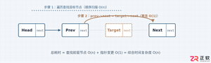
详细分析链表删除节点的时间复杂度,深入探讨单链表与双向链表在不同已知前提下的查找与删除开销,并结合完整代码与清晰图解进行对比总结。
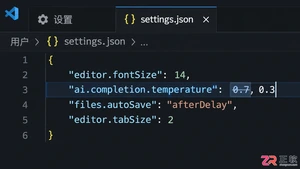
想知道如何让AI写出的代码更贴合你的习惯?本文手把手教你在VS Code中调整Codex相关模型参数,通过修改配置文件优化温度值和令牌限制,解决代码建议不准确或响应慢的问题。
通过实测展示Claude Code在终端中如何理解自然语言指令、自动修改代码文件并处理复杂编程任务,帮助开发者评估其实际辅助能力。
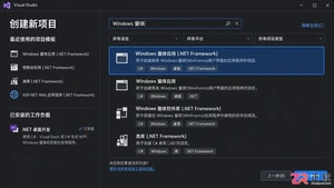
本教程详细讲解如何使用Visual Studio创建WinForms项目,通过添加按钮和标签控件并编写点击事件代码,实现一个基础的计数器功能,适合C#初学者快速上手Windows窗体应用开发。
详解Cursor编辑器中自动补全功能的开启与优化设置,涵盖Tab触发机制、上下文窗口调整及模型切换,帮助开发者解决补全延迟、干扰大等问题,提升编码流畅度。
详解Pandas中数据格式转换的核心方法,包括astype强制转换、to_numeric容错处理及日期解析技巧,解决常见类型错误并提升数据处理效率。
详细介绍在Visual Studio Code中安装Chinese (Simplified)语言包的方法,包括通过扩展市场搜索、安装及自动重启切换至简体中文界面的完整步骤,帮助开发者快速将编辑器本地化。

针对Cursor安装包默认锁定C盘且无路径选择界面的问题,提供通过手动移动文件并创建目录联结(Symbolic Link)的解决方案,实现将软件安装在其他磁盘分区。
详解Windows系统下Rust语言的安装步骤,重点解析rustup工具链管理机制,解决环境变量配置错误及MSVC链接器缺失问题,提供可复制的命令验证方法与常见报错的因果排查思路。
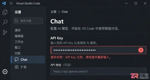
详解VS Code中Chat插件的安装与核心配置步骤,重点解决API连接失败、响应慢等常见问题,通过优化上下文设置提升代码生成质量,适合希望集成AI辅助工具的开发者阅读。




Photoshop 2026 是 Adobe 推出的专业图像处理与视觉设计软件,支持 Windows、macOS 和 iPad 等平台,广泛应用于摄影修图、电商设计、平面海报、数字绘画及视觉合成等创作场景。

Blender 是一款免费开源、跨平台的专业 3D 创作软件,集建模、动画、渲染、视频编辑与视觉合成等功能于一体,广泛应用于影视动画、游戏设计和建筑可视化等领域。软件支持 Cycles 物理渲染器与 Eevee 实时渲染引擎,并提供多边形建模、骨骼绑定、物理模拟等专业工具。Blender 兼容 Windows、macOS 和 Linux 系统,安装包轻巧、运行流畅,依托活跃的全球开发者社区持续更新,是从初学者到专业创作者都值得选择的正版 3D 创作工具。


Photoshop 2026 是 Adobe 推出的专业图像处理与视觉设计软件,支持 Windows、macOS 和 iPad 等平台,广泛应用于摄影修图、电商设计、平面海报、数字绘画及视觉合成等创作场景。
Blender 是一款免费开源、跨平台的专业 3D 创作软件,集建模、动画、渲染、视频编辑与视觉合成等功能于一体,广泛应用于影视动画、游戏设计和建筑可视化等领域。软件支持 Cycles 物理渲染器与 Eevee 实时渲染引擎,并提供多边形建模、骨骼绑定、物理模拟等专业工具。Blender 兼容 Windows、macOS 和 Linux 系统,安装包轻巧、运行流畅,依托活跃的全球开发者社区持续更新,是从初学者到专业创作者都值得选择的正版 3D 创作工具。