

Python数据可视化库:Matplotlib、Seaborn、Plotly、Bokeh等对比与选择
Matplotlib功能强大但语法复杂,适用于学术静态图表;Seaborn简洁美观,擅长统计可视化;Plotly与Bokeh支持交互式图表,后者更适合大型数据集;Altair声明式语法易用;PyECharts图表丰富且中文支持好。选型应依据静态、统计、交互或大数据等需求。
前言
在数据科学领域,可视化的重要性无需多言——好的图表能让数据“开口说话”,趋势、异常、分布一目了然。但Python生态里可视化库多得让人眼花缭乱:Matplotlib、Seaborn、Plotly、Bokeh……初学者往往不知道从哪个入手。这篇文章就把几个主流库的定位、优劣、适用场景逐一拆开,帮你快速建立选型框架。

常见的 Python 数据可视化库
1. Matplotlib
Matplotlib 是 Python 数据可视化的“老大哥”,问世多年,功能覆盖了你能想到的大部分图表类型。它和 NumPy、Pandas 配合得天衣无缝,文档和社区资源极其丰富。
优点:
- 功能强大,支持多种图表类型
- 高度可定制,几乎可以控制图表的 every aspect
- 与 NumPy 和 Pandas 无缝集成
- 文档丰富,社区支持广泛
缺点:
- 语法相对复杂,学习曲线较陡
- 默认样式不够美观,需要手动调整
- 交互式功能有限
适用场景:
- 静态图表
- publication-quality 图表
- 科学研究和学术论文
示例:
import matplotlib.pyplot as plt
import numpy as np

# 生成数据
x = np.linspace(0, 10, 100)
y = np.sin(x)

# 创建图表
plt.figure(figsize=(10, 6))
plt.plot(x, y, label='sin(x)')
plt.title('Sine Wa ve')
plt.xlabel('x')
plt.ylabel('sin(x)')
plt.legend()
plt.grid(True)
plt.show()
2. Seaborn
Seaborn 是站在 Matplotlib 肩膀上的高级封装,最大的卖点就是“省心”——代码量少,默认配色和样式都挺现代,尤其适合做统计图。
优点:
- 语法简洁,代码量少
- 默认样式美观,符合现代设计
- 支持复杂的统计图表
- 与 Pandas 数据框无缝集成
缺点:
- 定制性不如 Matplotlib
- 依赖 Matplotlib,性能受限于 Matplotlib
适用场景:
- 统计数据可视化
- 数据探索和分析
- 快速生成美观的图表
示例:
import seaborn as sns
import matplotlib.pyplot as plt
import pandas as pd
import numpy as np

# 生成数据
np.random.seed(42)
data = pd.DataFrame({
    'x': np.random.normal(0, 1, 1000),
    'y': np.random.normal(0, 1, 1000),
    'category': np.random.choice(['A', 'B', 'C'], 1000)
})

# 创建散点图
plt.figure(figsize=(10, 6))
sns.scatterplot(x='x', y='y', hue='category', data=data)
plt.title('Scatter Plot with Categories')
plt.show()

# 创建直方图
plt.figure(figsize=(10, 6))
sns.histplot(data['x'], kde=True)
plt.title('Histogram with KDE')
plt.show()
3. Plotly
Plotly 是交互式可视化里的明星,支持缩放、悬停、动画,还能直接导出为 HTML 或者嵌入 Web 页面。它的图表颜值也很高,默认就有“高级感”。
优点:
- 交互式图表,支持缩放、悬停等功能
- 美观的默认样式
- 支持 3D 图表和地图
- 可以导出为 HTML 或嵌入到 Web 应用中
缺点:
- 学习曲线较陡
- 对于大型数据集,性能可能会下降
- 免费版有一些限制
适用场景:
- 交互式数据可视化
- Web 应用和仪表板
- 数据探索和演示
示例:
import plotly.express as px
import pandas as pd
import numpy as np

# 生成数据
np.random.seed(42)
data = pd.DataFrame({
    'x': np.linspace(0, 10, 100),
    'y': np.sin(x),
    'z': np.cos(x)
})

# 创建交互式线图
fig = px.line(data, x='x', y=['y', 'z'], title='Interactive Line Plot')
fig.show()

# 创建散点图
fig = px.scatter(data, x='x', y='y', size='z', color='z', title='Interactive Scatter Plot')
fig.show()
4. Bokeh
Bokeh 的目标同样是 Web 交互,但它在处理大规模数据集和复杂交互逻辑上更有优势,比如实时数据更新、多维联动等。
优点:
- 高度交互式,支持复杂的交互功能
- 性能优秀,适合大型数据集
- 可以创建复杂的仪表板
- 支持实时数据更新
缺点:
- 学习曲线较陡
- API 相对复杂
- 文档不够完善
适用场景:
- 交互式 Web 应用
- 大型数据集的可视化
- 实时数据监控
示例:
from bokeh.plotting import figure, show
from bokeh.io import output_notebook
import numpy as np

# 生成数据
x = np.linspace(0, 10, 100)
y = np.sin(x)

# 创建图表
p = figure(title='Sine Wa ve', x_axis_label='x', y_axis_label='sin(x)', plot_width=800, plot_height=400)
p.line(x, y, line_width=2, color='blue')

# 显示图表
output_notebook()
show(p)
5. Altair
Altair 基于 Vega-Lite,走的是“声明式”路线——你只需要说“我要画什么”,它自动处理数据转换和坐标映射。语法非常简洁,适合快速探索。
优点:
- 声明式 API,语法简洁
- 自动处理数据转换和缩放
- 与 Pandas 数据框无缝集成
- 支持交互式图表
缺点:
- 功能相对有限
- 性能可能不如其他库
适用场景:
- 快速数据探索
- 统计数据可视化
- 简单的交互式图表
示例:
import altair as alt
import pandas as pd
import numpy as np

# 生成数据
np.random.seed(42)
data = pd.DataFrame({
    'x': np.linspace(0, 10, 100),
    'y': np.sin(x),
    'category': np.random.choice(['A', 'B'], 100)
})

# 创建图表
chart = alt.Chart(data).mark_line().encode(
    x='x',
    y='y',
    color='category'
).properties(
    title='Line Chart with Categories',
    width=800,
    height=400
)

chart.show()
6. PyECharts
PyECharts 是百度 ECharts 的 Python 封装,图表类型极其丰富,交互效果也很酷,而且中文文档齐全,在国内企业级项目中用得不少。
优点:
- 图表类型丰富
- 交互功能强大
- 中文文档完善
- 适合中国用户
缺点:
- 依赖 Ja vaScript
- 性能可能不如其他库
适用场景:
- 中国用户的项目
- 需要丰富图表类型的场景
- 企业级应用
示例:
from pyecharts.charts import Line
from pyecharts import options as opts
import numpy as np

# 生成数据
x = np.linspace(0, 10, 10).tolist()
y = np.sin(x).tolist()

# 创建图表
line = Line()
line.add_xaxis(x)
line.add_yaxis("sin(x)", y)
line.set_global_opts(title_opts=opts.TitleOpts(title="Sine Wa ve"))

# 渲染图表
line.render("sine_wa ve.html")
库的对比与选择
功能对比
| 库 | 静态图表 | 交互式图表 | 3D 图表 | 地图 | 统计图表 | 实时数据 |
|---|---|---|---|---|---|---|
| Matplotlib | ✅ | ❌ | ✅ | ✅ | ✅ | ❌ |
| Seaborn | ✅ | ❌ | ❌ | ❌ | ✅ | ❌ |
| Plotly | ✅ | ✅ | ✅ | ✅ | ✅ | ✅ |
| Bokeh | ✅ | ✅ | ✅ | ✅ | ✅ | ✅ |
| Altair | ✅ | ✅ | ❌ | ❌ | ✅ | ❌ |
| PyECharts | ✅ | ✅ | ✅ | ✅ | ✅ | ❌ |
性能对比
| 库 | 小型数据集 | 中型数据集 | 大型数据集 |
|---|---|---|---|
| Matplotlib | ✅ | ✅ | ⚠️ |
| Seaborn | ✅ | ⚠️ | ❌ |
| Plotly | ✅ | ⚠️ | ❌ |
| Bokeh | ✅ | ✅ | ✅ |
| Altair | ✅ | ⚠️ | ❌ |
| PyECharts | ✅ | ⚠️ | ❌ |
学习曲线
| 库 | 学习曲线 | 文档质量 | 社区支持 |
|---|---|---|---|
| Matplotlib | ⭐⭐⭐⭐ | ⭐⭐⭐⭐⭐ | ⭐⭐⭐⭐⭐ |
| Seaborn | ⭐⭐⭐ | ⭐⭐⭐⭐ | ⭐⭐⭐⭐ |
| Plotly | ⭐⭐⭐⭐ | ⭐⭐⭐⭐ | ⭐⭐⭐⭐ |
| Bokeh | ⭐⭐⭐⭐ | ⭐⭐⭐ | ⭐⭐⭐ |
| Altair | ⭐⭐ | ⭐⭐⭐⭐ | ⭐⭐⭐ |
| PyECharts | ⭐⭐ | ⭐⭐⭐⭐ | ⭐⭐⭐ |
选择建议
初学者:
- 如果你是 Python 数据可视化的初学者,建议从 Seaborn 或 Altair 开始,它们语法简洁,默认样式美观,适合快速上手。
需要静态图表:
- 如果你需要创建 publication-quality 的静态图表,Matplotlib 是最佳选择,它提供了最强大的定制能力。
需要交互式图表:
- 如果你需要创建交互式图表或 Web 应用,Plotly 或 Bokeh 是不错的选择。Plotly 语法更简洁,Bokeh 性能更好。
需要统计图表:
- 如果你需要创建统计相关的图表,Seaborn 是专门为统计数据可视化设计的,非常适合。
需要大型数据集:
- 如果你需要处理大型数据集,Bokeh 是性能最好的选择。
中国用户:
- 如果你是中国用户,PyECharts 提供了完善的中文文档和本地化支持,可能更适合你。
实战案例:数据可视化工作流
案例 1:数据探索
任务:探索一个数据集的基本统计信息和分布。
工具选择:Seaborn + Pandas
实现:
import seaborn as sns
import matplotlib.pyplot as plt
import pandas as pd
import numpy as np

# 加载数据集
iris = sns.load_dataset('iris')

# 查看基本信息
print(iris.head())
print(iris.describe())

# 绘制配对图
plt.figure(figsize=(12, 10))
sns.pairplot(iris, hue='species')
plt.title('Pairplot of Iris Dataset')
plt.show()

# 绘制箱线图
plt.figure(figsize=(12, 6))
sns.boxplot(data=iris, orient='h')
plt.title('Boxplot of Iris Features')
plt.show()
案例 2:交互式仪表板
任务:创建一个交互式仪表板,展示数据的多种视图。
工具选择:Plotly + Dash
实现:
import dash
import dash_core_components as dcc
import dash_html_components as html
import plotly.express as px
import pandas as pd
import numpy as np

# 生成数据
np.random.seed(42)
data = pd.DataFrame({
    'x': np.linspace(0, 10, 100),
    'y': np.sin(np.linspace(0, 10, 100)),
    'z': np.cos(np.linspace(0, 10, 100)),
    'category': np.random.choice(['A', 'B', 'C'], 100)
})

# 创建 Dash 应用
app = dash.Dash(__name__)

# 布局
app.layout = html.Div([
    html.H1('Interactive Dashboard'),

    html.Div([
        dcc.Graph(
            id='line-chart',
            figure=px.line(data, x='x', y=['y', 'z'], title='Line Chart')
        )
    ]),

    html.Div([
        dcc.Graph(
            id='scatter-chart',
            figure=px.scatter(data, x='x', y='y', color='category', title='Scatter Plot')
        )
    ]),

    html.Div([
        dcc.Graph(
            id='histogram',
            figure=px.histogram(data, x='y', color='category', title='Histogram')
        )
    ])
])

if __name__ == '__main__':
    app.run_server(debug=True)
案例 3:科学论文图表
任务:创建适合科学论文的高质量图表。
工具选择:Matplotlib
实现:
import matplotlib.pyplot as plt
import numpy as np
import matplotlib as mpl

# 设置全局样式
mpl.rcParams['font.family'] = 'Times New Roman'
mpl.rcParams['font.size'] = 12
mpl.rcParams['figure.figsize'] = (8, 6)
mpl.rcParams['lines.linewidth'] = 2
mpl.rcParams['axes.linewidth'] = 1.5
mpl.rcParams['axes.titlesize'] = 14
mpl.rcParams['axes.labelsize'] = 12
mpl.rcParams['xtick.labelsize'] = 10
mpl.rcParams['ytick.labelsize'] = 10
mpl.rcParams['legend.fontsize'] = 10

# 生成数据
x = np.linspace(0, 10, 100)
y1 = np.sin(x)
y2 = np.cos(x)
y3 = np.sin(x) + np.cos(x)

# 创建图表
fig, ax = plt.subplots()

ax.plot(x, y1, label='sin(x)', color='blue')
ax.plot(x, y2, label='cos(x)', color='red')
ax.plot(x, y3, label='sin(x) + cos(x)', color='green')

ax.set_title('Trigonometric Functions')
ax.set_xlabel('x')
ax.set_ylabel('y')
ax.legend(loc='upper right')
ax.grid(True, linestyle='--', alpha=0.7)

# 保存图表
plt.tight_layout()
plt.sa vefig('trigonometric_functions.png', dpi=300, bbox_inches='tight')
plt.show()
最佳实践
选择合适的库:根据你的需求和数据集大小选择合适的可视化库。
保持图表简洁:避免在一个图表中包含过多信息,保持图表简洁明了。
使用合适的图表类型:根据数据类型和要传达的信息选择合适的图表类型。
注意配色:使用和谐的配色方案,确保图表易于阅读。
添加必要的元素:包括标题、坐标轴标签、图例等,使图表更加完整。
优化性能:对于大型数据集,考虑使用性能更好的库或采样数据。
交互性:如果需要用户与图表交互,考虑使用交互式库。
文档和注释:为图表添加必要的文档和注释,解释图表的含义。
总结
Python 为数据可视化提供了丰富的武器库,每个库都有自己擅长的领域。对于初学者来说,不必面面俱到——先把 Seaborn 或 Altair 用熟,日常探索和汇报基本够用;需要发表论文时,Matplotlib 的精细控制无可替代;想要交付交互式看板,Plotly 或 Bokeh 可以拿出漂亮的成果;在国内企业环境里,PyECharts 的生态支持也很顺手。
说到底,选库不是比谁用得全,而是看场景是否匹配。把工具选对了,事半功倍。

详解如何在 Windows 电脑上通过 Microsoft Store 安装 Codex 桌面应用,包括启动登录、切换 Codex 模式、关联本地代码项目及终端环境配置的界面操作指引。
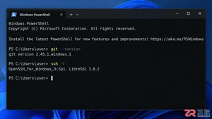
本文详解如何在Windows环境中使用PowerShell生成SSH密钥对,配置ssh-agent自动加载私钥,并将公钥安全添加至GitHub账户,最后通过git remote set-url切换为SSH地址,解决每次操作需输入账号密码的问题。

深入解析backdrop与background在网页开发及视觉设计中的区别。通过CSS代码示例,展示如何正确使用background设置元素背景,以及利用backdrop-filter创建弹窗遮罩模糊效果,避免概念混用。

详解 Windsurf IDE 在 Windows 系统的下载来源、安装步骤及首次启动界面。指导用户如何导入编辑器设置、打开项目文件夹及使用终端与 AI 功能,适合初次接触该工具的开发者阅读。

新手入门 ServBay 本地开发环境,详解安装包下载、Dashboard 状态监控、Packages 组件安装、Services 服务控制及 Websites 项目配置。掌握 .servbay.config 版本管理与日志排查技巧,快速搭建稳定的 PHP、Node.js 等多语言开发环境。
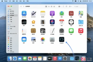
详解 CodeKit 在 macOS 下的安装步骤、项目导入方法、Sass与JavaScript编译设置及浏览器自动刷新功能,助您快速搭建高效的前端开发环境。

详解Windows环境下安装OpenAI Codex CLI的步骤,包括WSL环境检查、Node.js/npm配置、npm全局安装命令及首次启动验证,适合开发者快速上手。

学习如何配置 NativeRest REST API 客户端。涵盖 Windows/macOS/Linux 安装后的工作区创建、环境变量管理、请求编辑及响应查看步骤,帮助开发者快速完成基础环境搭建与连通性测试。
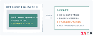
深入解析CSS中设置透明度的核心属性opacity,剖析子元素继承、事件穿透、层叠上下文等关键注意事项,并提供与rgba、hsla的实用选型对比。




WPS Office是一款面向macOS用户的综合办公套件,将文字处理、电子表格、演示文稿、PDF工具、模板与云协作整合在同一应用中。它兼容常见Microsoft Office格式,支持Intel及Apple芯片Mac,基础功能可免费使用,

Shapr3D是一款面向工业设计、机械工程、建筑概念和三维打印工作流的CAD软件。Mac版采用Parasolid建模内核,支持草图约束、实体建模、工程图、可视化渲染及常见CAD格式交换,并可通过账户在多台设备之间同步项目。

REAPER是Cockos开发的数字音频工作站,提供多轨音频与MIDI录制、剪辑、处理、混音和母带制作工具。Mac版兼容Intel与Apple芯片,支持AU、VST、VST3、CLAP等插件格式,并提供高度可定制的工作流程。

Adobe Photoshop 是面向摄影师、设计师和内容创作者的专业图像处理工具,可在 Windows 上完成照片修饰、选区抠图、图层合成、文字排版、绘画及生成式编辑。软件采用订阅授权,由 Creative Cloud 管理安装、更新与许

Adobe InDesign 是面向印刷与数字出版的专业页面排版工具,可制作书籍、杂志、宣传册、海报、交互式 PDF 和电子书。它提供精细的文字样式、多页面管理、印前检查及多格式输出能力,并能与 Photoshop、Illustrator

Adobe Illustrator 是用于绘制矢量图形、插画、图标、徽标和版式的专业设计工具。它以路径和锚点为核心,作品放大后仍能保持清晰,并提供画板、文字、渐变、图像描摹及精确变换等功能,适合品牌视觉、印刷物料、数字界面和商业插画创作。